CHAPTER 4[]
The beginning of October….. I have been quite underway with artwork for the map. Traditionally, the process used is to actually create the map, and build the artwork around it as shown here…
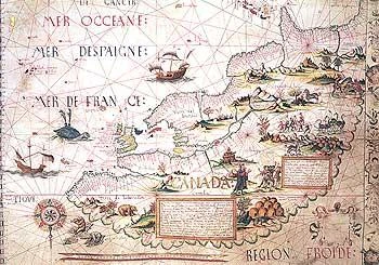
The layout of the map design and the primary design is laid out and then the placement of the art is established. The advantage to this process is that in the event that the time intensive art in the image and around the borders cannot be compromised by discrepancies in the map. The largest factor prone to mistakes would be the text itself. Being written in straight ink, making some of the simplest mistakes in the spelling or context that most would take for granted, would result in an untimely end for the map.
All in all, the process for creating an original “Portolan” map is monotonous to some of the most extremes of the word. Simple errors like misspellings or drawing a line in the wrong place or at the wrong angle can end days or weeks of work. Which I might add is the main reason the HUGE majority of period maps are not art intensive and lack color. The ones that do include those traits are rarities and would have taken in some cases years to complete.
In with the New….. process! The process I have always maintained is very much traditional. Having to keep artwork modest as to not overwhelm the map that is already created. More importantly, limiting my abilities as an artist to really get art intensive without fear of destroying what I have been working very hard and having much vested time.
The process that is going to be used for this map is quite different in that some of the art is being created first, before I even have started the map. Each piece of art is actually created as a separate piece. Each piece is scanned, and will be placed digitally in the map itself.
The advantage here is obviously to get art intensive without fear of destroying the map. And also, if during the final placement of the artwork, if any pieces need to be moved around for optimization, it will be quite a simple process whereas it would be impossible under traditional methods.
Introducing some of the artwork with this chapter…..
First, the Cartouche. Definitely is one of the most important pieces in that map. It is the title section and often contains other pertinent information.
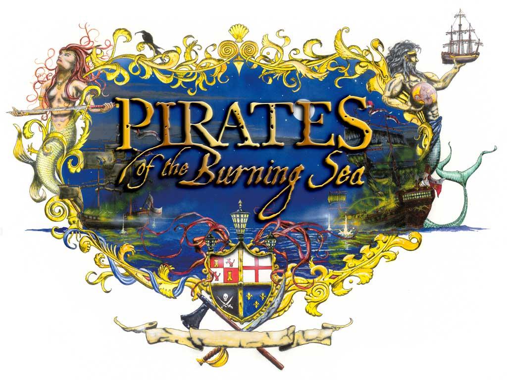
This Cartouche, like stated above is the primary title section of the map with “Pirates of the Burning Sea” over the background painting and a supplementary banner at the bottom which will say “Mappa Del Caribbe Grande, 1720 Ano”.
The crest symbolizes the four primary powers of the Caribbean during this period and in the game while all other aspects of the artwork serve distinct purpose, this will be discussed later.
The original Cartouche is actually over seventeen inches across and almost as high. It is a full size acrylic painting done with brush and enhanced by an Iwata Airbrush. This enables the image to be reduced and compound the detail.

The Primary Windrose. This is base image for the main Windrose for the map. There will be two other small roses on the map that are incomplete at this time. There will also be implanted glyphs in this image that correspond with direction.

This is an image for the scale. The map scale will actually be built extending out from underneath this painting.
This chapter is primarily an introduction into the style and type of artwork involved in the map. More artwork will appear in later releases.